The most common mistakes when designing dashboards
Year: 2021
The most common mistakes when designing dashboardsA while ago, we wrote an article On the benefits of using a dashboard. Many organisations deploy the use of dashboards to create visualised overviews of their KPIs (Key Performance Indicators). But, how do you design a dashboard that shows results as efficiently as possible?
The contents of a dashboard
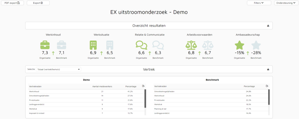
A dashboard should allow you to see and interpret how a variable is doing at a glance. Instead of a block of text, it shows the analysed information in graphs or figures. This means that dashboards should save the user time in understanding results by showing the most relevant information.1 The aim is to see in which areas the organisation is doing well, and which areas need more attention.

Yet it is often the case that using dashboards is made much more difficult for users than it should be, which can cause problems. Below are the most common mistakes made when setting up a dashboard and how to fix them.
Want to put as much information as possible on one page
It is natural that once you work with dashboards, you want to get everything out of them. This often means that you tend to show all elements that have been measured (within the organisation) at once. The reason for this would be to immediately put down a complete picture for the organisation. Unfortunately, it is often forgotten that not all parties within the organisation benefit from seeing the same data. This abundance of data can lead to misleading interpretations of the required results.2

Using too many colours
This applies to all visualisations. Organisations often tend to use lots of colours to make the environment look as beautiful and attractive as possible. In contrast, this can create more confusion and be perceived as overwhelming.
So choose a limited number of standard colours and use them consistently. Once you use red to show a negative measurement result, you obviously don't use that same colour to show a positive measurement result at another point. There is also valuable information on the internet on this subject. Such as colours used for a specific purpose in a dashboard and colour combinations which have been proven to go well together.

Selecting arbitrary charts
Graphs can quickly be misused. It is crucial that the correct chart is used when conveying information.3 Using an incorrect graph can result in unreadable information or information that is not interpreted correctly. Both consequences can contribute negatively to drawing the right conclusions. If an element is shown in a line graph, it is seen as a trend of time. Thus, valuable information can be displayed incorrectly and wrong decisions can be made.
Delve into the different types of charts and find out which chart best suits certain type of information. Is it a trend through time? Is it about proportions? Or do you want to compare elements? Make sure you know exactly what result of an element you want to demonstrate and base your choice of graph on that.

Not studying dashboard users
Some designers assume that every user has the same analytical qualities. As a result, users may face more challenges than necessary. Users may not know where the relevant information is and may find it too confusing as a result.
Check users' familiarity with (among other things) dashboard programmes and their knowledge of charts and statistics.4 The ultimate goal of the dashboard is to create an environment for users that is time-saving, not time-consuming by having to learn new skills.
The added value of a dashboard lies in creating an easy environment for users, who can find the desired information in a few blinks of an eye. Creativity is not always as important in such an environment. If it is a simple, but well-functioning dashboard, your users will benefit more than if it looks attractive but is difficult to use.
Sources
- Justinmind. (s.d.). Dashboard design: best practices and examples. Consulted from https://www.justinmind.com/blog/dashboard-design-best-practices-ux-ui/
- Alhamadi, M. (2020). Challenges, strategies and adaptations on interactive dashboards. Proceedings of the 28th ACM Conference on User Modeling, Adaptation and Personalization. doi: 10.1145/3340631.3398678
- Durcevic, S. (2020, September 9). 20 dashboard design principles & best practices to enhance your data analysis. Consulted from https://www.datapine.com/blog/dashboard-design-principles-and-best-practices/
- Ouwehand, G. (s.d.). In 5 steps to the perfect dashboard. Retrieved from https://www.axians.nl/business-analytics/blog/in-5-stappen-naar-het-perfecte-dashboard/

